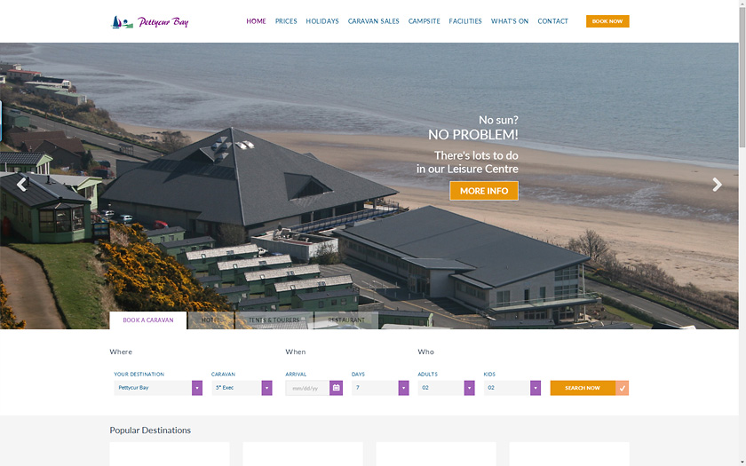
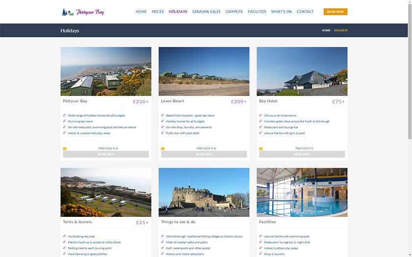
Responsive website design
Using a responsive and modern-looking template, I redesigned the layout of this large website so that it would display well on both mobile and desktop devices.
The homepage uses a large, dynamic 'image slider' to display photos of the park and its views. Navigation is via a 'mega-menu' at the top of each page, or by using the 'breadcrumbs' near the top or photos and links within the page.